The first thing a consumer remembers about a brand is the logo of the company. The logo registers in the mind easily and has a high impact. The market is progressing towards minimalist logo design. A simple yet compelling design that doesn’t boast of unnecessary splashes is a simple design that drives the point.
The luxury transport industry, be it automobiles, private jets, or yachts, follows a minimalist marketing mantra.
Minimalist logos stay in memory for a long time and have a global appeal. The colors, typography, and fonts—these elements are the top players in making a logo compelling. A simple yet profound logo can reach people from different cultures and speaking different languages.
A minimalist logo helps in maintaining uniformity. When a logo is simpler, adapting it to different mediums like print and digital becomes unchallenging.
Sometimes when a logo is too graphically heavy, the meaning gets lost, and certain smaller details get lost while using it for smaller material like a business card.
Now let’s look at some of the iconic minimalist logos in the luxury transport industry.
The powerful Ferrari logo has an interesting story behind it. The black horse was painted as a sign of luck on the jet during World War I.
The logo was placed in the car for the first time by Alfa Romeo, for whom Enzo raced, to honor Enzo. After the race, the logo was first officially seen on the Ferrari 125S.
The most iconic logo, BMW, stands for Bayerische Motoren Werk in German. The white and blue colors are known to represent airplane propeller motion, as initially the company was established to make aircraft.
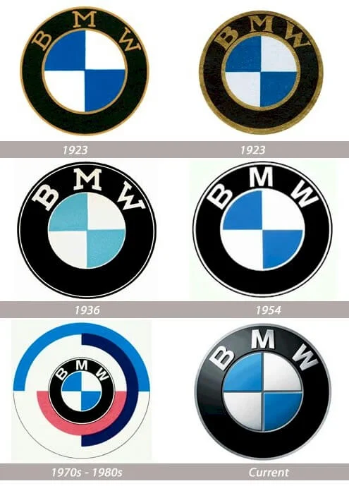
But that is not true. White and blue were chosen to honor the birthplace of the Bavaraia brand. The logo, which depicts power, luxury, and style, has been revamped five times.
The French automobile brand Citroën—the twin chevron logo—draws its inspiration from the founder André Citroën’s previous gear-cutting business.
The Lamborghini logo represents Founder Ferruccio Lamborghini’s zodiac sign—bull.
It shows his passion for bullfighting. The gold raging bull in the logo screams power, speed, and fearless spirit.
Audi’s most simple four-ring logo is one of the most remembered and impactful logos. The logo tells the story of the car manufacturer, August Hoch.
He started his own company, Audi, and later, to improve its performance, merged with four other car manufacturing companies. Hence, the four rings in the logo.
Another most popular logo in the automobile industry is the Maserati logo.
The logo is the emblem of founder Alfieri Maserati’s home town, Bologna. It is also the place where the company’s first plant was built.
The three-sided star logo of Mercedes-Benz inspires dreams in millions of people.
The 3 sides represent land, sea, and air. With a closed circle, they want to communicate their power in the automobile industry.
Hype Luxury, – world’s largest luxury aggregator for cars, private jets, and yachts, also drives the same emotion.

The H says we are drawing parallels and moving upwards. The choice of colors is carefully picked to express luxury, class, and elegance. There is due thought behind the font selected too.
The font that sets the luxury tone is carefully chosen to draw the right audience to the world of luxury transport. The way it is written has a contemporary appeal to it.
Hype luxury logo shield denotes safety, prestige, and power. The overall feel the Hype Luxury logo provides is trustworthiness and credibility, carrying the power to reinforce brand identity in the luxury market.


